Fashion
Cracker Barrel Logo: History, Meaning, Old Design, and Latest Updates in 2026


The Cracker Barrel logo is one of the most recognizable visual identities in American restaurant culture. For decades, its distinctive lettering, warm gold and brown colors, and illustration of an old-fashioned man leaning against a wooden barrel represented the company’s country-store atmosphere and traditional hospitality. The logo became closely associated with Southern-style comfort food, rocking chairs on front porches, antique decorations, and the nostalgic shopping experience that distinguishes Cracker Barrel Old Country Store from many other restaurant chains.
In 2025, the company introduced a simplified logo that removed the familiar man and barrel illustration, prompting widespread discussion among customers and commentators. The redesign became a major branding controversy, highlighting the emotional connection many people have with familiar corporate symbols. By 2026, Cracker Barrel had returned to its former logo, making the story particularly interesting for anyone searching for the old Cracker Barrel logo, the 2025 redesign, its meaning, and the company’s current branding.
This guide explores the history, design, symbolism, controversy, and current status of the Cracker Barrel logo, explaining why a restaurant emblem became such a widely discussed part of American popular culture.
What Does the Cracker Barrel Logo Look Like?
The classic Cracker Barrel Old Country Store logo features the company name in distinctive lettering alongside an illustration of a seated or leaning older man beside a wooden barrel. The traditional design uses warm, rustic colors, particularly gold, brown, and black, creating an appearance associated with traditional country stores and old-fashioned American hospitality.
The illustrated man is commonly called the Old Timer. His appearance, including his simple clothing and relaxed posture, helps communicate familiarity and a welcoming atmosphere. The barrel reinforces the company’s name and its historical connection to the country-store tradition, while the lettering makes the brand recognizable on restaurant signs, menus, packaging, and retail merchandise.
The design is memorable because it combines several visual elements into a single identity. Rather than using a generic food-related symbol, Cracker Barrel developed a logo that evokes a particular setting and experience. Customers can connect the emblem with the company’s restaurants, gift shops, rocking chairs, and traditional menu offerings.
According to the company’s official history, the Old Timer began as a generic figure drawn on a napkin in 1977. Over time, the character became a symbol of the brand’s warmth, authenticity, and neighborly hospitality.
Cracker Barrel Logo History: From 1969 to 2026
Cracker Barrel opened its first restaurant and country store in Lebanon, Tennessee, in 1969. Founder Dan Evins developed the concept around the experience of traditional country stores, creating a place where travelers and local residents could enjoy familiar food and browse distinctive retail merchandise. The brand’s identity was designed to communicate this atmosphere rather than resemble a conventional fast-food chain.
The company’s name also has a historical explanation. In traditional country stores, barrels filled with soda crackers could serve as gathering points where people exchanged news and stories. Cracker Barrel chose the name to reflect these informal moments of connection. The barrel in the familiar logo therefore has a direct relationship to the brand’s origin story.
The illustrated Old Timer appeared in the company’s visual identity in 1977. The character gradually became one of its most distinctive features, helping Cracker Barrel establish a consistent look across locations and marketing materials. Over the years, the logo underwent several refinements, but its traditional design remained recognizable.
The following timeline summarizes the most important developments:
1969
The company is founded
The first Cracker Barrel Old Country Store opens in Lebanon, Tennessee, establishing the restaurant’s country-store concept.
1977
The Old Timer enters the identity
An illustrated old-timer character becomes part of the brand’s visual history and eventually a familiar symbol for customers.
2025
A simplified logo sparks debate
The company unveils a text-focused design that removes the illustrated man and barrel, provoking strong reactions.
2026
The classic logo returns
Cracker Barrel’s 2026 annual report confirms that the company returned to its former logo during the first quarter of the year.
The timeline shows why the Cracker Barrel logo is more than a decorative restaurant sign. Its history is closely connected to the company’s identity and its customers’ memories of visiting the restaurants.
What Does the Cracker Barrel Logo Mean? Colors, Barrel, and Old Timer
The meaning of the Cracker Barrel logo comes from its combination of traditional imagery, distinctive lettering, and warm colors. Each element reinforces the company’s emphasis on country hospitality and the atmosphere of an old-fashioned general store.
The Old Timer is the most recognizable illustrated element. The company explains that the character has come to represent warmth, authenticity, and neighborly hospitality. His relaxed posture and traditional clothing help create the impression of a familiar person welcoming guests into a community gathering place. Although many people associate the figure with the restaurant’s Uncle Herschel breakfast offering, the company officially refers to the illustrated figure as the Old Timer.
The barrel connects the logo to the origin of the company’s name. Historically, barrels of soda crackers were associated with general stores where customers could gather and talk. The barrel is therefore both a literal reference and a symbol of social connection.
The gold and brown color palette reinforces the rustic aesthetic. Gold provides warmth and visibility, while brown evokes wood, traditional furnishings, and the natural materials associated with country stores. Together, the colors create an identity that works well on roadside signs, restaurant menus, packaging, and retail products.
Finally, the lettering gives the logo a distinctive appearance. Its decorative style complements the illustration and reinforces the brand’s historical positioning. The overall result is a visual identity that communicates familiarity and tradition rather than technological innovation or fast-paced urban dining.
An important point is that the logo’s meaning should be understood through the company’s documented history rather than unsupported internet rumors. Fact-checking by PolitiFact found no evidence for claims that the logo’s curved flourish represents a whip; Cracker Barrel has described it as a common calligraphic flourish.

The 2025 Cracker Barrel Logo Controversy Explained
In August 2025, Cracker Barrel unveiled a simplified logo as part of a broader brand-refresh initiative. The updated design retained the company’s name and familiar gold and brown colors but removed the illustrated Old Timer, the barrel, and the words “Old Country Store.” The company presented the redesign as a modernization of its visual identity while maintaining a connection to its established brand.
The response was immediate and highly polarized. Some customers welcomed a cleaner, more contemporary design, while others felt that removing the Old Timer and barrel stripped away the very elements that made the logo distinctive. The reaction spread across social media and news coverage, turning a corporate design decision into a national conversation about nostalgia, brand identity, and customer loyalty.
The controversy was not limited to the logo itself. Cracker Barrel was also working on changes to restaurant interiors, replacing some traditional decorative elements with lighter colors and more modern furnishings. For customers who associated the chain with antique-style decorations, wooden furniture, and country-store charm, the combined changes raised concerns about whether the company was moving too far from its roots.
The episode demonstrated how difficult it can be to modernize an established brand when its visual identity is closely connected to customers’ personal memories. A logo that has appeared on restaurant signs, menus, and merchandise for decades can carry emotional significance beyond its commercial purpose.
Cracker Barrel’s experience also showed that brand recognition is not always improved by simplification. A cleaner design may work well in digital environments, but familiar visual elements can be valuable because they help customers identify the business and understand what it represents.
Why Cracker Barrel Returned to Its Old Logo in 2026
The most important update for anyone searching for the Cracker Barrel logo in 2026 is that the company returned to its former logo during the first quarter of 2026. This development is documented in Cracker Barrel Old Country Store’s annual report filed with the U.S. Securities and Exchange Commission. The same report says the company discontinued its modern test-store remodels during that period.
The reversal followed substantial public criticism of the 2025 rebranding effort. The company’s annual report identifies negative publicity and customer reactions to its branding initiatives as business challenges during 2026. It also reports declines in comparable restaurant and retail sales, with lower guest traffic among the factors contributing to the results. These disclosures establish that the rebranding controversy formed part of a broader business challenge, although they do not prove that the logo alone caused every decline.
Returning to the classic logo restored the visual elements that many customers recognized: the Old Timer, the barrel, and the traditional lettering. For long-time visitors, the familiar emblem represented continuity with the company’s country-store origins.
The decision also highlights an important lesson for businesses: a recognizable brand identity can be an asset that should be carefully preserved. Visual updates may help a company reach new audiences, but successful changes need to respect the associations existing customers already have with the brand.
Cracker Barrel’s official history continues to emphasize the company’s roots in hospitality, shared meals, and traditional country-store experiences. Its return to the classic logo is consistent with that positioning, bringing its public-facing identity back toward the familiar design that helped define the chain for decades.
Where to Find the Official Cracker Barrel Logo and Images
Readers looking for the current Cracker Barrel logo, historical designs, or brand images should start with the company’s official website and newsroom. These sources are preferable to unofficial image collections because they provide information directly from the business.
Official website: Cracker Barrel Old Country Store — explore the company’s restaurants, menus, country-store products, and current brand presentation.
Company history: Cracker Barrel About Us — learn about the company’s origins, its name, and the Old Timer character.
Official newsroom: Cracker Barrel News Releases — review company announcements and official updates.
The logo is a trademark associated with Cracker Barrel Old Country Store. If you intend to use it on a website, in a commercial publication, or in promotional materials, check the applicable trademark and usage requirements. Images found online may have separate licensing restrictions, and displaying a logo does not automatically grant permission to use it commercially.
Frequently Asked Questions About the Cracker Barrel Logo
What is the current Cracker Barrel logo in 2026?
Cracker Barrel returned to its classic logo during the first quarter of 2026, following the controversy surrounding its simplified 2025 redesign. The company’s annual report confirms the return to the former logo.
Who is the man in the Cracker Barrel logo?
The illustrated man is officially known as the Old Timer. Cracker Barrel says the character began as a generic figure drawn on a napkin in 1977 and later became a symbol of its hospitality and traditional values.
Why did Cracker Barrel change its logo in 2025?
The company introduced a simplified design as part of a wider brand refresh intended to modernize its visual identity and appeal to customers while maintaining its established brand. The removal of the Old Timer and barrel generated substantial criticism.
Why did Cracker Barrel bring back the old logo?
The company reversed the redesign after widespread negative reactions. Its 2026 annual report confirms that the classic logo was restored during the first quarter of the year.
What do the gold and brown colors represent?
The colors reinforce the brand’s traditional country-store appearance. Gold creates warmth and visibility, while brown complements the rustic aesthetic. These are interpretations of the visual design rather than a claim that every color has an officially defined symbolic meaning.
When was the Cracker Barrel logo first introduced?
Cracker Barrel opened in 1969, and the company says its Old Timer character began as a drawing in 1977. The logo has evolved through several versions since then.
Conclusion: The Cracker Barrel Logo’s Lasting Significance
The Cracker Barrel logo is a strong example of how a company’s visual identity can become part of its cultural reputation. Its traditional lettering, warm colors, wooden barrel, and Old Timer illustration helped communicate the country-store atmosphere that distinguishes the restaurant chain.
The 2025 redesign revealed how strongly customers identified with those familiar elements. When the company removed the illustration, the response showed that the logo represented more than a name: it also reflected memories, traditions, and expectations associated with visiting Cracker Barrel.
By returning to its classic logo in 2026, the company restored a recognizable symbol of its history. For anyone researching the Cracker Barrel logo, its meaning, design changes, or current appearance, the central takeaway is clear: a successful brand identity can depend as much on preserving familiar traditions as on introducing modern design.
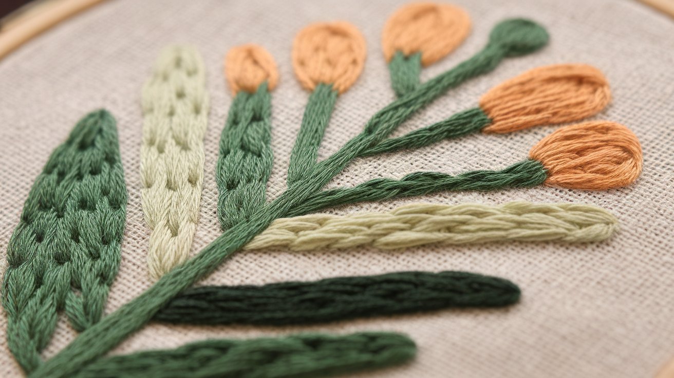
Stem stitch is one of the most useful and recognizable embroidery stitches for creating smooth outlines, curved stems, vines, borders, lettering, and decorative details. As its name suggests, it is traditionally associated with embroidered flower stems, but its applications go far beyond botanical designs. Whether you are a complete beginner learning hand embroidery or an experienced stitcher looking for a reliable outlining technique, understanding embroidery stitches stem can give your projects a cleaner and more professional appearance.
The stem stitch is valued because it creates a smooth, slightly twisted line that follows curves beautifully. Unlike some simple running or backstitch techniques, its overlapping stitches produce a rope-like appearance that adds texture while maintaining a relatively narrow outline. It can be worked with cotton embroidery floss, stranded thread, wool, silk, and other suitable embroidery materials, depending on the project.
In 2026, stem stitch remains a practical choice for modern embroidery because it works equally well in traditional floral patterns, contemporary line art, clothing decoration, hoops, home décor, personalized gifts, and embroidery lettering. Learning this single stitch can therefore open the door to many different creative techniques.
What Is the Stem Stitch in Embroidery?
The stem stitch is a surface embroidery stitch used primarily for outlines and flowing lines. It is especially effective when you need a continuous line that follows curves and organic shapes. The finished line has a subtle braided or twisted appearance because each new stitch overlaps the previous one in a consistent direction.
One of its biggest advantages is versatility. You can use stem stitch to outline flower petals, draw branches, define leaves, create decorative borders, embroider names, or add fine details to illustrated designs. By changing the thread thickness, number of floss strands, stitch length, and tension, you can create anything from a delicate line to a bold decorative outline.
The stitch is also relatively easy to learn. Beginners generally need only a hoop, fabric, embroidery needle, thread, and a pattern or transferred design. Once the basic movement becomes familiar, the stitch can be worked quickly and consistently.
How to Do a Stem Stitch Step by Step
Learning how to do stem stitch is easier when the movement is broken into simple stages. Begin by securing your fabric in an embroidery hoop so that it is reasonably taut without being stretched excessively. Thread your needle with an appropriate length of embroidery floss and secure the thread using the method you prefer.
Bring the needle up through the fabric at the beginning of your design line. Then take the needle down a short distance along the line and bring it back up approximately halfway between the starting point and the end of the intended stitch. The key feature is that the working thread should remain consistently on the same side of the stitching line as you continue.
Continue making short stitches along the drawn line. Each stitch overlaps or connects visually with the previous one, creating the characteristic twisted stem-stitch appearance. Keep your stitch lengths reasonably consistent, particularly when working on curves.
The most important beginner tip is to maintain even thread tension. Pulling the thread too tightly can cause puckering, while leaving it too loose can create uneven loops. Practice on a scrap piece of fabric before starting an important project.
Stem Stitch vs. Backstitch and Other Outline Stitches
The stem stitch is sometimes confused with backstitch, but the two produce noticeably different results. Backstitch creates a relatively straightforward continuous outline, while stem stitch produces a more textured, rope-like line.
Backstitch is often an excellent choice for crisp outlines, lettering, geometric designs, and areas where a clean linear appearance is desired. Stem stitch, on the other hand, is particularly attractive for curves, stems, vines, decorative borders, and flowing shapes.
Another useful comparison is chain stitch. Chain stitch produces connected loops and generally has a more prominent decorative texture. Stem stitch creates a narrower line, making it useful when you want texture without making the outline overly heavy.
The best stitch depends on the design. There is no requirement to use stem stitch everywhere. Combining stem stitch, backstitch, satin stitch, French knots, chain stitch, and lazy daisy stitch can create much richer embroidery.
Best Uses for Stem Stitch
The most traditional use of stem stitch is outlining flower stems and branches, but modern embroidery artists use it in many ways. It works particularly well for botanical designs because the natural curves of stems and vines complement the stitch’s flowing structure.
You can also use stem stitch for flower outlines, leaf veins, decorative frames, lettering, borders, animal illustrations, landscapes, and abstract line art. When worked with metallic or specialty thread, it can become a striking decorative element.
Stem stitch is also useful for embroidery lettering. Its smooth curve makes it possible to create elegant handwritten-style words, especially when the design contains flowing strokes. However, very small lettering can become difficult to read, so a finer thread and shorter stitch length may be preferable.
For clothing and textile projects, stem stitch can add decorative outlines to shirts, jackets, tote bags, pillowcases, table linens, and fabric accessories. The stitch is flexible enough for many surfaces, although heavily worn items may require additional care to protect the embroidery.
Choosing Thread, Needle, and Fabric
Good materials make learning embroidery stem stitch considerably easier. Stranded cotton embroidery floss is one of the most accessible choices because you can separate it into individual strands and adjust the thickness of your stitching.
For delicate outlines, using fewer strands can produce a fine and elegant line. More strands create a thicker, more noticeable outline. The ideal needle should match the thread and fabric. A sharp embroidery needle with an eye large enough for the selected thread generally works well for common cotton fabrics.
Fabric choice also matters. Beginners often find it easier to practice on a medium-weight, tightly woven fabric rather than extremely thin or loosely woven material. The fabric should be stable enough to support repeated needle movements without distorting.
Before beginning the final project, test your selected thread, needle, fabric, and stitch tension together. A short practice sample can reveal whether the thread is too thick, the needle is too large, or the fabric needs additional stabilization.
Tips for Perfect Stem Stitch Results
The quality of stem stitch depends heavily on consistency. Try to keep individual stitches approximately the same length. Very irregular stitches can make the line appear bumpy rather than smoothly twisted.
Curves require particular attention. On a tight curve, use shorter stitches because they allow the embroidery line to change direction more gradually. Longer stitches may create sharp angles or make the curve appear uneven.
Thread tension is equally important. Avoid pulling the thread aggressively after every stitch. Instead, use enough tension to lay the thread neatly against the fabric. If the fabric begins to wrinkle or pucker, your tension may be too tight.
Another useful technique is to plan the direction of your stitching before starting. Choose a direction and maintain it consistently throughout the section. This helps the twisted texture remain uniform.
Finally, practice. Stem stitch can look awkward during the first few attempts, but the movement becomes much more natural once your hands develop muscle memory.
Frequently Asked Questions About Embroidery Stem Stitch
What is stem stitch used for?
Stem stitch is primarily used for outlines, especially curved lines such as flower stems, vines, branches, decorative borders, and lettering. It can also be used for many other surface embroidery designs.
Is stem stitch easy for beginners?
Yes. Stem stitch is generally beginner-friendly once the basic hand movement is understood. Practicing on scrap fabric can help develop consistent stitch length and tension.
What is the difference between stem stitch and backstitch?
Backstitch creates a straightforward continuous outline, while stem stitch has a characteristic twisted or rope-like texture. Stem stitch is particularly effective for curved and organic designs.
How many strands of embroidery floss should I use?
There is no single correct number. Fewer strands create a finer line, while additional strands produce a thicker and more prominent effect. The choice depends on the fabric, pattern, and desired appearance.
Why does my stem stitch look uneven?
Uneven stitch lengths, inconsistent thread tension, or changing the working direction can affect the appearance. Try using shorter stitches on curves and maintaining consistent tension.
Can stem stitch be used for lettering?
Yes. Stem stitch can create beautiful flowing embroidered lettering, especially when the letters contain curves. For small lettering, use an appropriately fine thread and short stitches.
Conclusion
Embroidery stitch stem is a versatile technique that deserves a place in every hand embroidery toolkit. Its smooth, slightly twisted appearance makes it particularly useful for flower stems, vines, curved outlines, decorative borders, lettering, and artistic line work.
The basic technique is straightforward: establish a line, make short overlapping stitches, maintain a consistent working direction, and control your thread tension. With practice, you can adjust stitch length and thread thickness to create different visual effects.
Whether you are making a traditional floral hoop, personalizing clothing, creating embroidered artwork, or experimenting with modern textile designs in 2026, the stem stitch provides a dependable way to create elegant and expressive lines. Start with simple curves and botanical shapes, practice your tension, and gradually incorporate the stitch into more complex embroidery projects.
Fashion
www.redand whitemagzcom: A Complete 2026 Guide to Digital News, Lifestyle Content, and Online Magazine Trends
The digital publishing industry continues to grow rapidly, offering readers instant access to news, lifestyle features, technology updates, entertainment stories, business insights, health advice, and educational content. As more readers turn to online magazines for reliable and engaging information, www.redand whitemagzcom has emerged as a keyword of growing interest among internet users searching for fresh digital content and informative articles.
In 2026, digital magazines are more than simple news websites. They have become comprehensive information platforms that combine expert opinions, practical guides, trending topics, and reader-friendly articles in one convenient destination. This guide explores www.redand whitemagzcom, its potential value for readers, the role of online magazines, and why digital publishing continues to shape how people consume information worldwide.
What Is www.redand whitemagzcom?
www.redand whitemagzcom is commonly associated with the growing world of digital magazine platforms that publish informative articles across a wide range of subjects. Modern online magazines provide readers with convenient access to valuable content without the limitations of traditional print publications.
Digital magazine platforms typically focus on topics such as:
- Breaking news
- Technology
- Business
- Lifestyle
- Travel
- Education
- Health and wellness
- Entertainment
- Fashion
- Finance
Instead of waiting for monthly or weekly print editions, readers can access updated information anytime using computers, tablets, or smartphones.
Why Digital Magazine Platforms Continue to Grow in 2026
The popularity of online publications continues to increase because readers expect fast, accurate, and accessible information. Digital magazines offer flexibility that traditional publishing cannot easily match.
Several factors contribute to the continued success of platforms like www.redand whitemagzcom:
- Instant content updates
- Mobile-friendly reading experiences
- Wide topic coverage
- Searchable articles
- Global accessibility
- Interactive multimedia content
- Improved user experience
- Easy content sharing
- Regular publishing schedules
These advantages make digital magazines an important source of information for readers seeking current and practical content.
Popular Content Categories on www.redand whitemagzcom
One of the strengths of modern online magazines is their ability to cover diverse subjects that appeal to readers with different interests.
Technology and Innovation
Technology remains one of the fastest-changing industries. Readers often seek updates about:
- Artificial intelligence
- Smartphones
- Software
- Cybersecurity
- Consumer electronics
- Digital productivity
- Cloud computing
- Emerging innovations
Technology articles help readers stay informed about the latest developments affecting both personal and professional life.
Lifestyle and Personal Development
Lifestyle content continues attracting large audiences by providing practical advice for everyday living.
Popular lifestyle topics include:
- Home improvement
- Personal productivity
- Relationships
- Wellness
- Mental well-being
- Fashion
- Beauty
- Food
- Self-improvement
These articles focus on helping readers make informed choices that improve daily life.
Business and Finance
Business-focused readers often explore articles discussing:
- Entrepreneurship
- Investment strategies
- Small business growth
- Financial planning
- Economic trends
- Career development
- Digital marketing
- Remote work
As the global economy evolves, business education remains valuable for professionals and entrepreneurs alike.
The Benefits of Reading www.redand whitemagzcom
Digital magazines provide several advantages over traditional printed publications. Readers appreciate having immediate access to updated information whenever they need it.
Some of the most important benefits include:
- Current information
- Convenient online access
- Diverse article categories
- Easy navigation
- Professional writing
- Educational resources
- Expert opinions
- Time-saving research
- Mobile accessibility
Readers can quickly discover articles matching their interests without purchasing multiple magazines or newspapers.
How Online Magazines Improve the Reader Experience
Modern digital publishing places significant emphasis on user experience. Readers expect websites that load quickly, display clearly on mobile devices, and organize information efficiently.
Platforms associated with www.redand whitemagzcom typically benefit from features such as:
- Responsive website design
- Fast loading pages
- Search functionality
- Organized content categories
- High-quality images
- Easy article navigation
- Social sharing options
- Regular content updates
These features encourage readers to spend more time exploring articles while discovering new topics of interest.
Digital Publishing Trends Shaping www.redand whitemagzcom in 2026
Digital publishing continues evolving alongside technological innovation. In 2026, readers increasingly expect personalized experiences, trustworthy information, and engaging multimedia content.
Some of the leading publishing trends include:
- AI-assisted content recommendations
- Interactive articles
- Mobile-first publishing
- Video integration
- Podcast content
- Data-driven journalism
- Reader engagement tools
- Voice search optimization
- Visual storytelling
- Search engine optimization
These developments allow online magazines to provide richer experiences while meeting the expectations of modern audiences.
Why www.redand whitemagzcom Appeals to Modern Readers
Today’s internet users consume information differently than previous generations. Rather than relying on a single source, readers prefer platforms that combine educational articles, practical advice, industry insights, and trending stories.
www.redand whitemagzcom reflects this evolution by representing the type of digital publication readers increasingly seek.
Whether someone is interested in technology, travel, business, education, health, lifestyle, or entertainment, comprehensive online magazines offer centralized access to informative content.
Readers appreciate websites that publish:
- Accurate information
- Easy-to-read articles
- Balanced reporting
- Practical guides
- Expert analysis
- Updated industry trends
- Educational resources
- Helpful recommendations
These characteristics contribute to stronger reader engagement and long-term audience growth.
Conclusion
In 2026, www.redand whitemagzcom represents the continuing growth of digital publishing and the increasing demand for high-quality online content. As readers look for trustworthy information across technology, lifestyle, business, health, travel, education, and entertainment, digital magazines remain an essential part of the modern information landscape.
By delivering well-organized, informative, and reader-focused content, platforms associated with www.redand whitemagzcom demonstrate how online magazines continue adapting to changing reader expectations. As digital publishing evolves, readers who value timely information, expert insights, and engaging articles will continue turning to comprehensive online magazine platforms for knowledge, inspiration, and practical guidance.

123 Movies: Complete Guide to Online Movie Streaming, Features, Safety, and Alternatives in 2026

Language Exchange 2026: Complete Guide to Learning Languages, Finding Partners, and Building Fluency

Wizard of Oz Sphere: Tickets, Experience, 4D Effects, and Las Vegas Guide 2026


- celebrity4 months ago
Evin Harrah Cosby: Biography, Family Background, Career, Education, and Private Life
- celebrity4 months ago
Christopher Stokowski: Biography, Family Background, Career, and Private Life
- celebrity4 months ago
Laurence Bailey: Biography, Career, Achievements, and Lasting Legacy
- celebrity4 months ago
Marcy Wudarski: Biography, Career, Family, and Life Story
- Lifestyle3 months ago
TravelTweaks Hotels: The Complete Guide to Smarter Hotel Stays and Better Travel Experiences in 2026
- celebrity4 months ago
Valentina Marie Skelton: A Remarkable Life Beyond Hollywood Fame
- Business3 months ago
Weakspurn.com: A Complete Guide to the Platform, Features, Benefits, and Online Presence in 2026
- Tech3 months ago
Almawadahit.com Technology: The Complete 2026 Guide to Digital Innovation, Tech News, AI, and Online Resources